Jim’s Guide for Unit 2: Markets: The Supply and Demand Model
Underlying most arguments against the free market is a lack of belief in freedom itself.”
–Milton Friedman, Nobel Laureate in Economics
It is not from the benevolence of the butcher, the brewer, or the baker, that we expect our dinner, but from their regard for their own self-interest. We address ourselves, not to their humanity but to their self-love and never talk to them of our own necessities but of their advantages.

–Adam Smith, The Wealth of Nations
It is a common human belief to think that somebody is “in charge” – to believe that everything happens because somebody, somewhere made the decision. When we were children, of course, this belief was natural. After all, most things in our lives were decided by our parents, our teachers, or some other “grown-up” authority figure. As adults, it is common to continue to believe that somebody is (or at least ought to be) “in charge” and making the decisions. Often it is the government or the head of some major corporation that we think is responsible for “how things are”. And, it is true in most social institutions. Any government has a people who are “in charge” and make the decisions. Corporations and large organizations have a boss or CEO. Any army has a commanding general. Even football and hockey teams have captains and head coaches. But a market, one of the most common and oldest social institutions we have, doesn’t have a boss. In a free, competitive market, nobody is “in charge”.
This search for somebody to “be in charge” is what makes free markets difficult for some people to understand. No single authority decides how much of a product (the quantity) will be sold and purchased in a free, competitive market. No single authority decides what the price for that product will be in a free, competitive market. Instead, the quantity sold & purchased and the price simply happen as the result of a large number of people all making independent, self-interested decisions. At first glance, it seems like a market should be utter chaos with no reason to think anything positive will result. After all, there’s all these people thinking only about “what’s good for me” and nobody is “in charge” to make sure these many different decisions are coordinated and that there’s no waste. Yet, in reality, just the opposite occurs. A free, competitive market will not only result in an orderly coordination of decisions, but the results will be the most efficient outcomes possible. Economists sometimes describe this phenomena as “emergent order”. From what looks like it should chaos, order actually emerges. And not just any order, the most efficient order possible.
So, if nobody’s “in charge”, how does the price and quantity sold/purchased get determined in a market? The story of how price and quantities get determined in a market is the story of demand and supply. The story of supply and demand (it makes no difference what order we say it), is powerfully communicated using a graphical model. This supply and demand model is what we are going to study in this unit. It’s THE foundation of all economists analyses of markets, including markets that don’t work so well.
We will begin the chapter by studying and defining demand and supply separately. Then we combine them into a single model/graph and use it to determine the price and quantity sold/purchased. Finally, we will examine what happens when government decides it knows better than the market and the government decides to intervene and limit what prices or quantities can be sold/purchased.
In this unit, we have three main objectives:
- Introduce the concept and terminology of markets, buyers, sellers, demand, and supply.
- Explore the relationship between price and the quantity demanded – a relationship we call “demand” – and what the Law of Demand says by using graphs and numerical examples.
- Explore the relationship between price and the quantity supplied or produced – a relationship we call “supply” – and what the Law of Supply says by using graphs and numerical examples.
Demand Curves and The Law of Demand
A demand curve looks like a relatively simple line: it is simply a downward-sloping curve drawn on a graph. The demand curve, and it’s shape, represent what economists call The Law of Demand. Of course, it’s not actually a legal law. It’s a regular relationship that is so predictable, so common that we call it a law, just like how physicists refer to the “law of gravity”. In short, the Law of Demand states that for any particular good, the higher the price, the smaller the quantity people will be willing and able to buy, other things being equal. That’s actually a very loaded statement. There’s a lot being said there. Likewise, the simple downward-sloping demand curve that represents this statement on a graph is also loaded with lots of information and conditions.
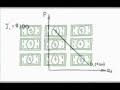
 A lot of later trouble in understanding can be prevented by spending a moment to really fix in our minds what is represented by a demand curve, such as the one to the right. First, the space we are dealing with now is different from what the PPF model used. In this space, the two axes are Quantity and Price. The horizontal axis represents a quantity of the particular good in question in units. It doesn’t really matter what units we use, as long as it’s relevant and consistent. If the good were “soft drinks”, then the Q axis could be “ounces of soft drink” or “bottles” or even “cases”. The vertical axis is the price that is charged in the market for each unit of the quantity axis. In the U.S., of course, this is usually represented as “dollars per unit”. Each point in this space then represents a possible quantity sold at a particular price. It should make sense now why in economics we only use the upper-right quadrant of the x-y coordinate space. Points in other quadrants wouldn’t make sense: they would use negative numbers and wouldn’t have any economic meaning. We can’t easily charge a “negative price”, just like we can’t purchase a “negative quantity” of a good.
The demand curve itself represents the limits of what the consumer (purchaser) will pay. Any point on the demand curve corresponds to a specific quantity of the good AT a specific price. For any particular quantity, you go up to the demand curve and the corresponding price represents the highest price the purchaser will pay and still be willing to buy that quantity. Similarly, we can go out from any particular price to the demand curve, drop down and find the maximum quantity the purchaser is willing to buy at that price.
 This means that the demand curve is really dividing the space of all the possible price-quantity combinations into two regions: the price-quantity combinations the purchaser is willing and able to buy, and the price-quantity combinations the purchaser is not willing or able to buy. This is illustrated in the graph to the left.
Let’s suppose you go to the store shopping. You have an idea of what particular product you want, but you don’t know the price you’ll have to pay. Since you don’t know the price, you don’t know how many units you’ll buy. After all, if it’s a really high price that is being charged, you can only buy a very few units or perhaps only buy one unit, or not even buy any at all. That’s because at a high price, your limited budget will only allow to buy one or a few units (…able to buy). In addition, at a high price, you’ll probably conclude that there are other products you could spend your money on and get much better value or “bang for your buck” (willing to buy…). Of course in reality you most likely rely simply on your gut reaction to the price when you see it to determine whether it’s worthwhile or not, and how many units to buy at that price. But let’s suppose you sat down before entering the store and made a list of all the possible prices you might see inside the store. Then, for each price you listed the maximum number of units you would be willing and able to buy at that price. You would then have what we call a demand schedule. If you plot the price-quantity combinations you listed, you would have demand curve.
Of course, you aren’t the only person in the store or in the market. Many other people are shopping too. Some of them have bigger budgets and some have smaller budgets than you. Others don’t share your tastes either and might like the product. Together, all the shoppers make up what we call market demand. Market demand is simply adding up, for each possible price, the total quantity that could be sold to all shoppers together with each shopper making their own buy-no buy decision. Plot the totals for the market demand schedule and you have a market demand curve.
What changes Demand?
Demand, then, is the relationship between price and quantity purchased that emerges from a buyer’s willingness and ability to buy. Of course, our willingness to buy sometimes changes. Our ability to buy definitely changes over time. The demand curve represents the willingness and ability to buy at a particular point in time and given a particular set of conditions or circumstances. When these other conditions or circumstances change, then the demand curve moves or “shifts”. We typically think of demand curves shifting horizontally to the left or to the right, depending upon what condition or circumstance has changed.
What kinds of conditions or circumstances change/shift a demand curve? Many things can happen that would change your willingness to buy a particular product. To simplify things, though, economists classify all these many different changes into four types: changes in income, tastes, alternatives, and expectations. Typically the most important type of change in your alternatives is a change in the prices of other goods. Any change in one of these four factors will shift a demand curve to the left or to the right.
Suppose you repeat the shopping trip we imagined above, but this time your boss has just given you a very significant raise – an increase in your income. For most goods and products, you are now more willing to buy a larger quantity of the good in question because you can afford more. Your demand curve shifts towards the right on the graph. Any particular price now results in a larger quantity number. A shift rightward is called an “increase in demand”. This would be the normal reaction for most goods when we get more income to spend, and thus we call such goods normal goods. There are, however, some goods that we are less willing to buy when we get a higher income. For example, Ramen Noodles, using a coin laundromat instead of owning your own washer, or buying a used car instead of a new one. These goods are called inferior goods. It’s not that economists think the products are inferior, it’s that people demonstrate that when their incomes go up, they would rather buy other, more desirable goods.
The prices of other products also affect how willing you are to shell out good money for this particular product. When the prices of other products change, it will shift your demand for this product. When the price of chicken goes up, you’re more willing to buy beef. Your demand curve for beef shifts to the right because beef and chicken are considered substitutes. You’re willing to substitute beef for the chicken that is now more expensive. Not all products are substitutes for each other. For example, hot dogs and hot dog buns are complements. Purchasers want to consume complements together as a “package deal”, so when the price of hot dogs goes up, it makes you less willing to buy the buns. After all, a higher price on hot dogs causes you to buy fewer hot dogs. Since you are buying fewer hot dogs, your need for the buns is reduced. Your demand curve for hot dog buns shifts to left, or decreases.
Similar shifts in demand curves can be caused because people’s tastes or expectations have changed. Economists use the word tastes to cover all our feelings about the usefulness, fashionability, attractiveness, or image of the product.
| TIP: Make sure you understand the difference between a “change in demand” and a “change in quantity demanded”. A change in demand means the demand curve has shifted because some condition such as income, tastes, prices of other products, or expectations has changed. A change in quantity demanded is simply a movement from one point on the demand to curve to another point on the demand curve as a result of the price of this good changing. |
Supply, The Law of Supply, and Changes in Supply
Once you know how the demand curve works and what it represents, the supply curve and what it represents is fairly easy. Graphically, of course, the key difference is that the supply curve slopes upward while the demand curve slopes downward. Economically, though, the supply curve represents the willingness and ability to supply quantities of the good to the market at different prices. The supply curve represents the Law of Supply which says that the price and the quantity supplied to the market by sellers is directly (positively) related. In other words, at higher prices sellers will be willing and able to produce and sell more units. At very low prices, sellers are not able to produce and sell as many units.
Typically at this point in the course, students’ greatest problem with the supply curve (or the Law of Supply) is understanding intuitively why the curve slopes upward. Many of us have had the experience where if you buy a larger quantity, the seller will give you a discount. Such a situation isn’t really a good test of the “correctness” of the supply curve. The supply curve we’re interested in here is the market supply curve: the sum of the willingness of all potential producers to sell. There is a phenomenon called diminishing marginal returns that causes the supply curve to slope upwards. We will examine the diminishing marginal returns and costs in closer detail in a later unit. At this point, it’s important to accept that the supply curve does slope upward. For intuitive purposes, you can think of it as it takes higher and higher prices to get more and more people to be willing to sell their goods. Often this is because these additional sellers/producers aren’t as efficient as those who sell as lower prices. Thus, to make a profit, it takes a higher price to get more businesses to be willing to produce and sell the product.
And, just as with the demand curve, we need to make the same distinction between changes in supply vs. changes in quantities supplied.
Reading Guide – Assigned Readings
In addition to the Jim’s Guide (above), you should read and study in your Mandel Economics: The Basics textbook:
- Chapter 1 IntroductionJIm’s Comment: You should definitely read this as it helps introduce the whole subject and textbook. However, the primary emphasis of this unit is on chapter 2.
- Chapter 2: Demand and Supply: The Basics of the Market Economy
JIm’s Comment: Read the whole chapter, but pay very close attention and study pages 25-31. Pay close attention to the main narrative of the chapter and be sure you understand the numerical tables and graphs. Pay less attention to the “examples” in the various boxes – they are there only to illustrate the principle concepts. Focus on those concepts. If you are having difficulty with the graphs or tables, check out the Appendix after Chapter 1.
Practice Quiz
Click here for the Unit 2 practice quiz. The practice quiz will open in a new tab/window.
Worksheet
Unit 2 Worksheet – Data and Directions After you complete the data problems on this worksheet page, you should answer the questions and enter your answers in learning mgt system (Moodlerooms at HFCC).
Closer Look – Need More Help?
Professor Nelson’s (another LCC Professor) Tutorials on Micro that are relevant to this unit:
- Market equilibrium illustrated with tables
- Market equilibrium illustrated graphically
- The difference between a change in demand and a change in quantity demanded
- The difference between a change in supply and a change in quantity supplied
Other Video Tutorials
Dr. Mary McGlasson of Chandler Community College in Phoenix, AZ (known as mjmfoodie on YouTube) has numerous videos which are pretty decent. Here are the ones relevant to this unit. Since there are so many of them, I’ve linked to them instead of embedding them in this page.
- 11
 4:44 Episode 11 – Demand by mjmfoodie 24,061 views
 - 12
 5:13 Episode 12: Change in Demand vs Change in Quantity Demanded by mjmfoodie 20,657 views
What’s Next?
In the next unit, we’ll look at the interaction between demand and supply to determine the market equilibrium price. We’ll then consider what happens when events change demand or supply.